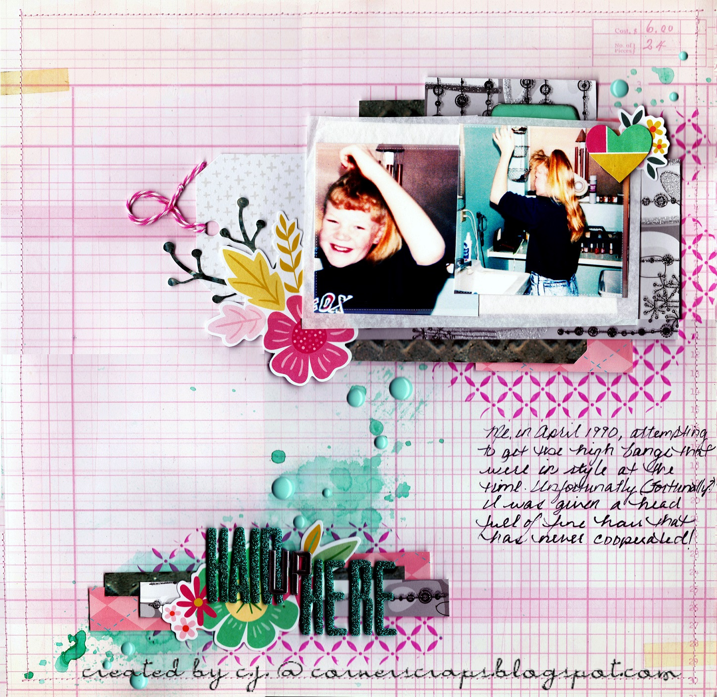
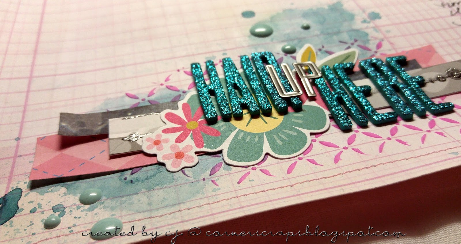
Hair Up Here

Hair Up Here

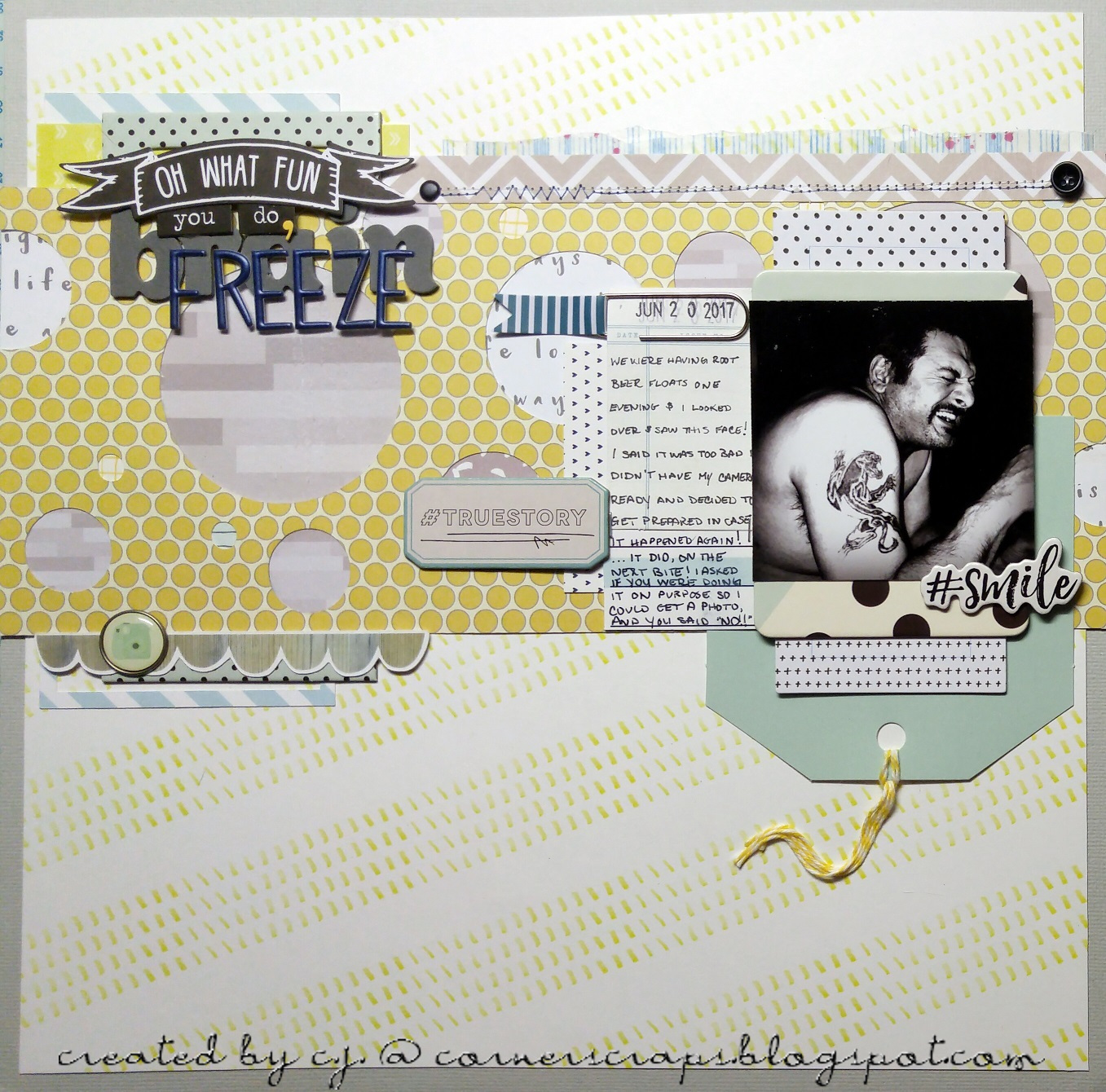
A layout featuring photos of yours truly at (almost) 11 years old! The journaling explains it all!

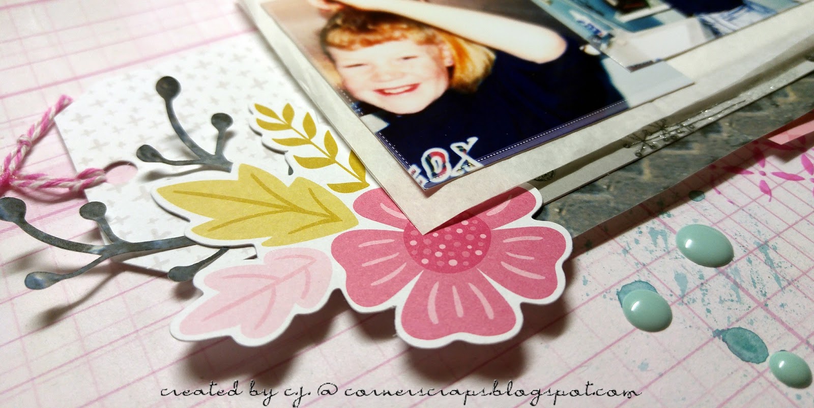
Me, in April 1990, attempting to get the high bangs that were in style at the time. Unfortunately (Fortunately?) I was given a head full of fine hair that has never cooperated!

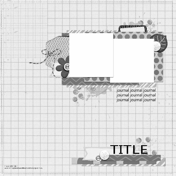
This layout is for two challenges, the first being the August 1, 2017 Stuck?! Sketches challenge, using the following sketch:

The second challenge is the “Ugly Paper Challenge” over at scrapbook.com where I am the hostess. I first did the challenge back in August 2011 with the, I believe, original hostess. Then in 2012 (I think) the second hostess took over, and in March 2015 I took it over! So, as far as I know, I am the third hostess of the challenge. I haven’t done the challenge every month since I first found it (with the previous hostesses), but I have always loved the challenge! In short, two “ugly” papers and one (or more!) “ugly” embellishment(s) are mailed to another player (I give out addresses!) at the beginning of the month, and players have until the end of the month to create their layouts! The papers have to still be recognizable, and the embellishment is optional (it counts as two extra votes at the end of the month!). Now, this isn’t to say any particular papers or embellishments are “ugly,” but the combination given is! Most of the time anyhow! The challenge is receiving a combination that you may have never even considered putting together on your own, plus you are receiving papers that may not be your “style.” Anyhow, I just wanted to make it be known that “ugly” is a subjective term, and I have received (on more than one occasion) papers that were wonderful, even though the sender didn’t think so!

When I received my papers this month I immediately thought of my being a “tom-boy” growing up, but I just didn’t know what photos I had to use with them. It turns out I didn’t have the photos needed, my grandmother did, but I didn’t know that until our family has had to start sorting through her 88 years worth of possessions after she passed on August 3, 2017. And while it has been a sad time for the family, we have also discovered many items, mementos, and photos we didn’t know existed.

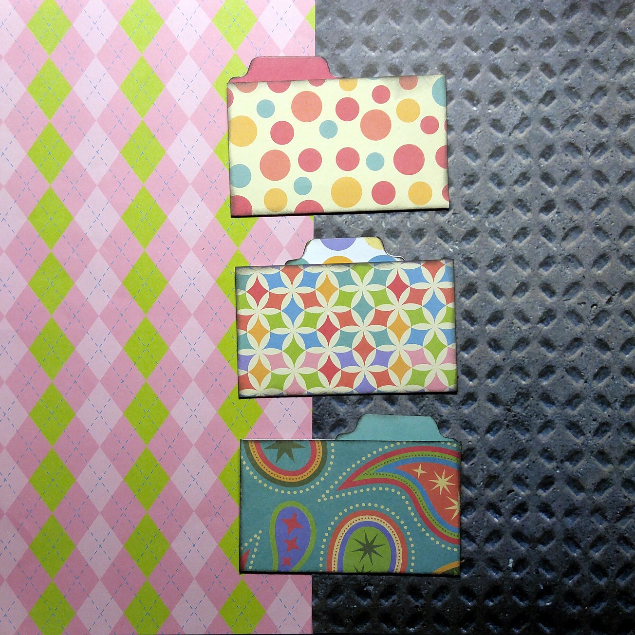
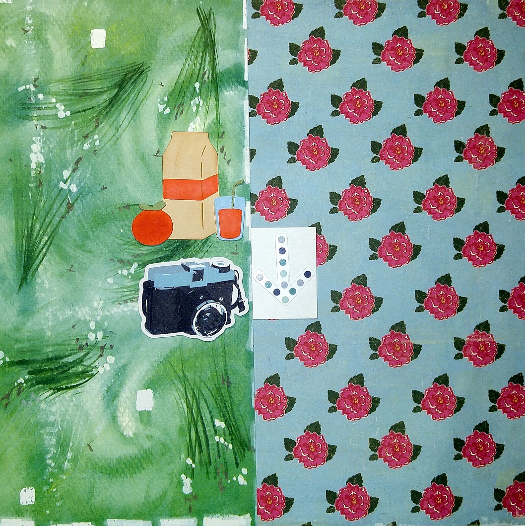
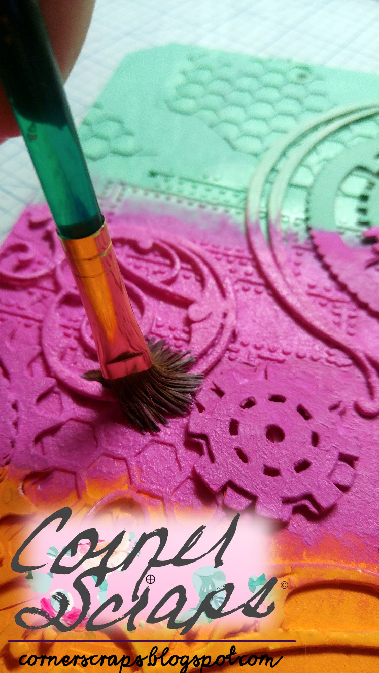
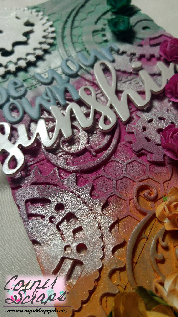
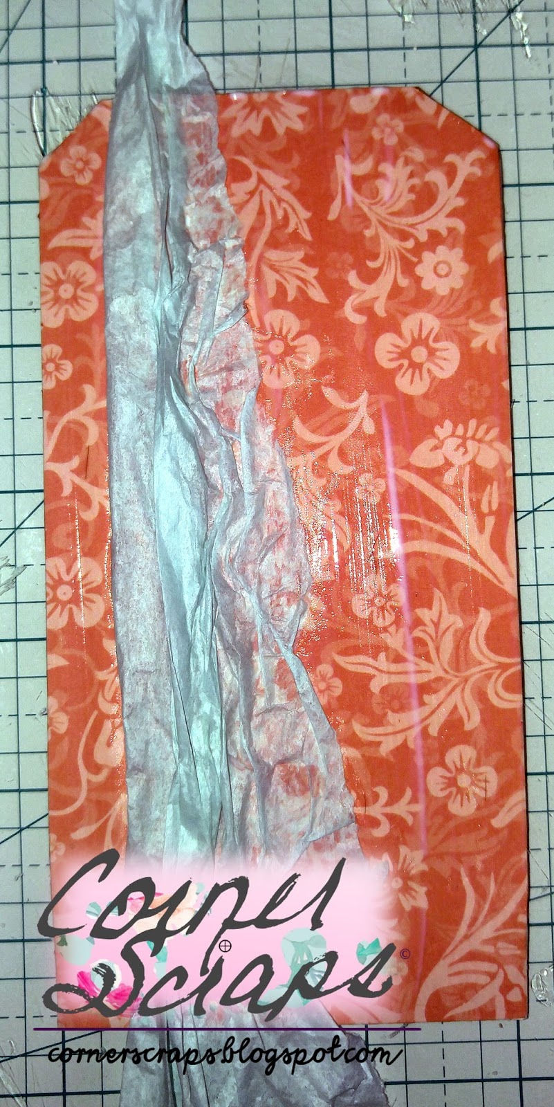
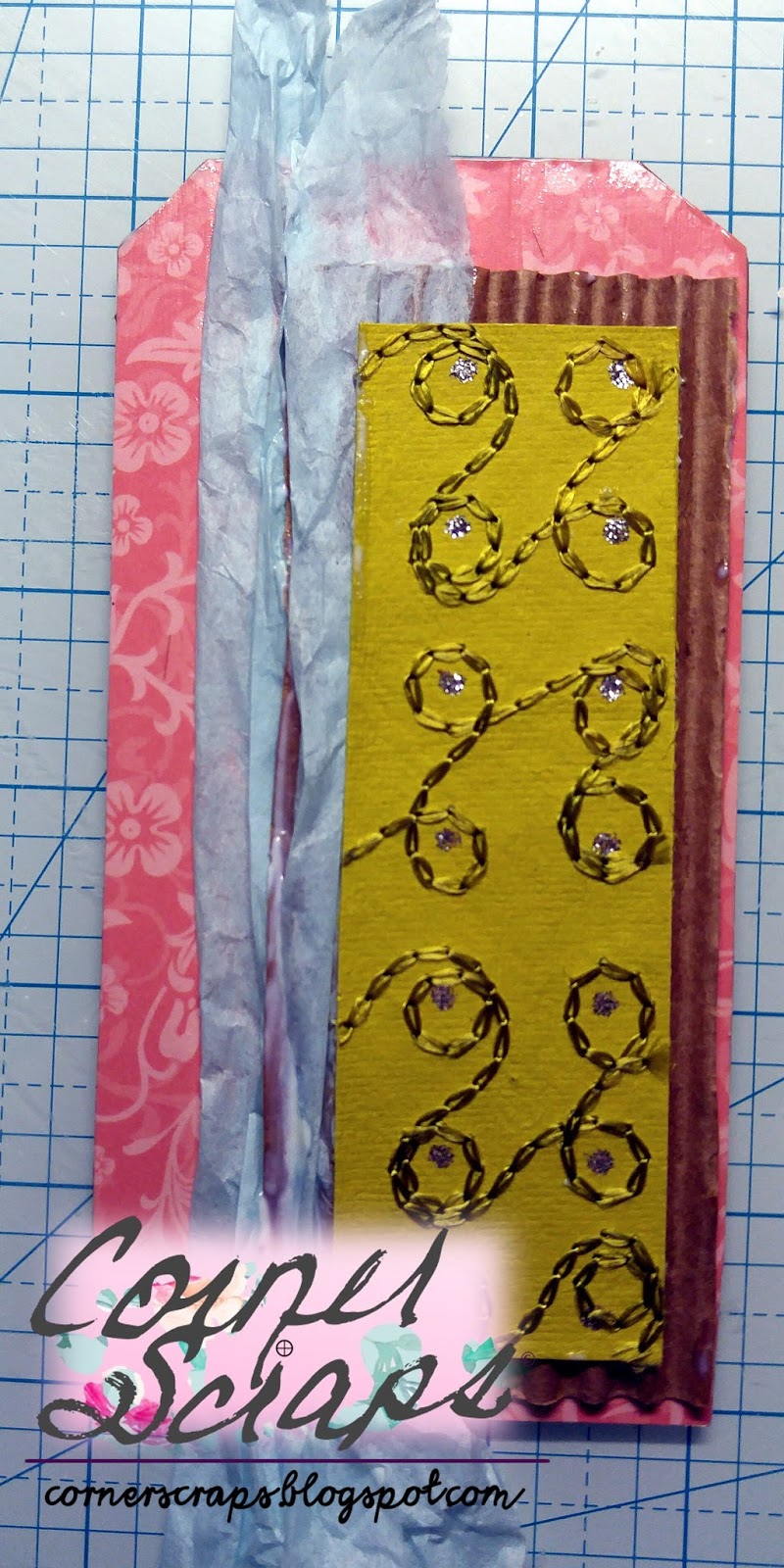
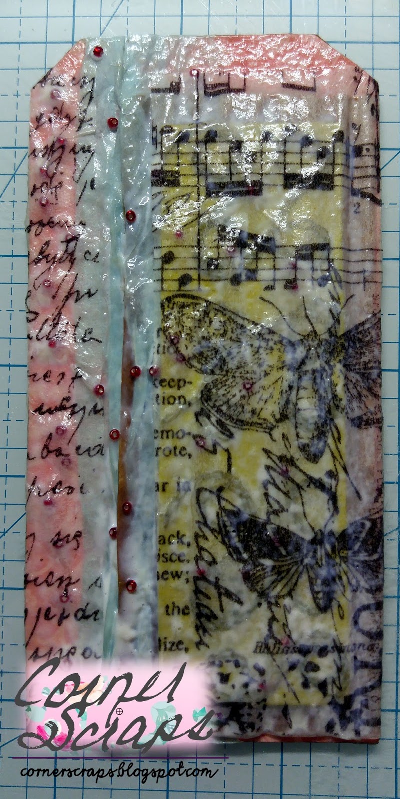
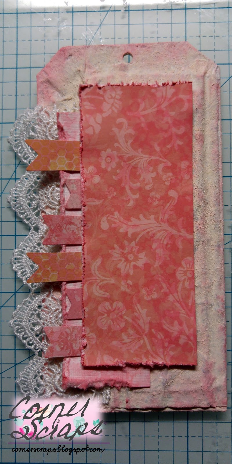
The papers, and embellies, I received for the August 2017 Ugly Paper Challenge

Product List:

  • Crate Paper – Chasing Dreams Collection – 12 x 12 Double Sided Paper – Royale
  • Ranger Glossy Accents
  • Sharpie Fine Point Writing Pens
  • Shimmerz Paints: Paste-eez “Raspberry Sherbet,” and Coloringz “Well Blue Me Down.”
  • Carta Bella Paper – 6 x 6 Stencil – Lattice
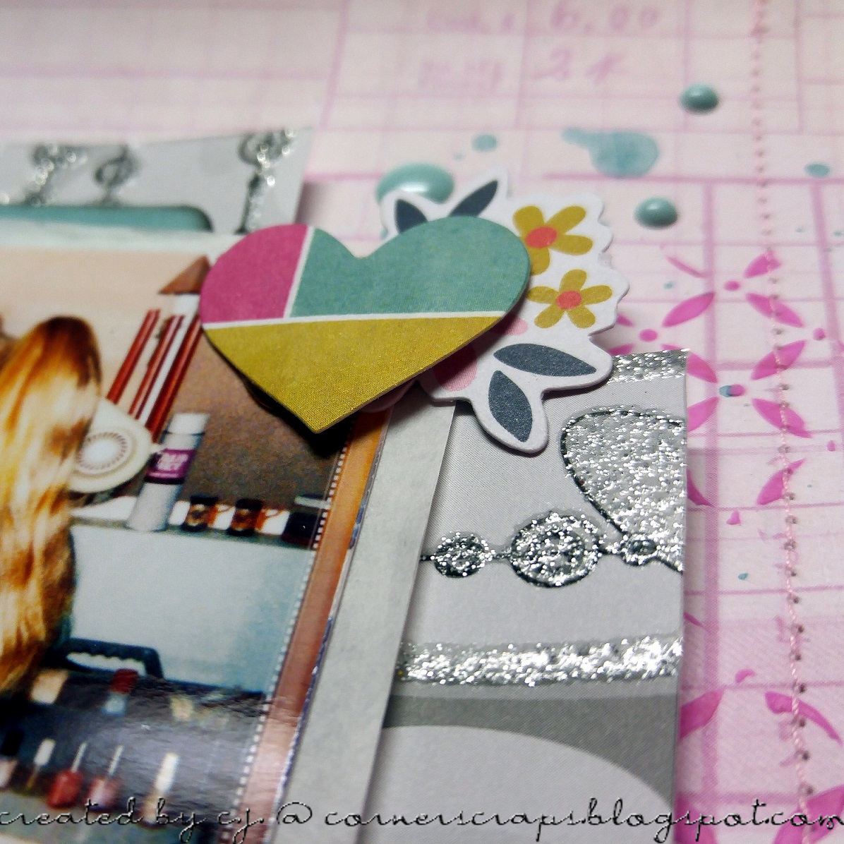
  • Pink Paislee – Paige Evans – Oh My Heart Collection – Ephemera with Foil Accents
  • American Crafts – Starshine Collection – Thickers – Glitter – Fitzgerald – Teal
  • Tim Holtz – Idea-ology Collection – Industrious Stickers – Deco Type
  • The black/grey glittery paper is DCWV, but it was in my scraps, and I couldn’t even being to guess what the stack was it came from!
  • Hip Kit Club Exclusive Enamel Dots (March 2017)
  • Unknown pink & white twine

Brain Freeze!

Oh what fun you do, Brain Freeze
This layout encompasses multiple challenges! First, it will be entered into the Stuck?! Sketches July 15, 2017 Challenge! The challenge for the second half of July was to use the following sketch designed by Laura Whitaker. For my layout, I decided to rotate the design counter-clockwise, which I thought worked better for me, especially since I have a longer title. This layout is also going to be entered in the July Sewing Challenge, July 5 Ingredients + Challenge, July Music Inspiration Challenge, July Hoarders Challenge, and the July Foodies Challenge over at scrapbook.com. Whew! That’s a lot of Challenges for one little ol’ layout!
July 15, 2017, Stuck?! Sketches Challenge Sketch designed by Laura Whitaker.
Now, to try and explain the challenges over at scrapbook.com! For the Music Inspiration Challenge, I was tasked with finding inspiration for my layout using a song chosen for me. My song was “You Make Me Wanna” by Usher. I’ll tell the truth, I never listened to the song, I read the lyrics over on A to Z Lyrics and I knew I’d never be able to handle actually hearing it! It’s just nowhere near the type of music I listen to! When I first thought up what photo I wanted to use, I was originally going to have my title based off the title of the song, and was going to have it be “You Make Me Wanna Scream,” but there is an Ozzy song (“Let Me Hear You Scream”) that has a very similar line. I just couldn’t connect Ozzy & Usher in my mind!! So then I decided to incorporate “This is what you do,” which is a line found over and over in the song! And I actually had “This is what you do, Brain Freeze” on the layout…but it just didn’t look right! I came across the “Oh What Fun” banner, laid it on the layout, and decided the title was going to be “Oh What Fun You Do, Brain Freeze,” because now it was a sarcastic title, and I speak fluent sarcasm! Whew, all that to use two words from the song!
For the 5 Ingredients+ Challenge, I had to incorporate yellow, button(s), smile, circle(s), and border, which I did. The Sewing Challenge had a twist of using red, white, and/or blue thread, I used blue and white (had to use at least two for the twist). The Foodie Challenge is to do a layout involving food, and the Hoarders Challenge is to use hoarded items on your layout (I believe everything I used is at least a year old)!
The journaling reads:
“We were having root beer floats one evening & I looked over & saw this face! I said it was too bad I didn’t have my camera ready and decided to get prepared in case it happened again! …It did, on the next bite! I asked if you were doing it on purpose so I could get a photo, and you said ‘NO!!'”
I love layering! The cut file is a free file from Paper Issues called Peek-A-Boo Circles.
Yes, adding the “#smile” was more sarcasm (as well as a requirement for the 5 Ingredients+ Challenge)!
Like I said, I love layering! And I love layering titles and mixing fonts!
Product List:
  • The tag under the photo is from Studio Calico
  • The papers “filling in” the circle cuts come from:
  • Pink Fresh: Felicity line, or
  • Pink Paislee : Paige Evans: Paper 06 from the Fancy Free Collection or,
  • Elle’s Studio: Little Moments: Details or,
  • Hip Kit Club Exclusive: Medowbrook: Notes From Home
  • Hip Kit Club Exclusive: Medowbrook: Diamond Shine
  • Webster’s Pages: Allison Kreft: Recorded: This & That
  • Teresa Collins – Summer Stories Collection – Border Strips with Glitter Accents
  • Thickers: Junebug: Charcoal
  • Tim Holtz: Big Chat
  • Thickers: Junebug: Charcoal
  • October Afternoon: Daily Flash: Story Book
  • Hip Kit Club Exclusive Alphas
  • Hip Kit Club Exclusive Washi Tape
  • Hip Kit Club Exclusive Puffy Stickers
  • Dear Lizzy Date Stamp
  • Ranger Jet Black Archival Ink
  • Sharpie Fine Point
  • Simple Stories – Sunshine and Happiness Collection – Decorative Brads
  • Crate Paper – Gather Collection – Thickers – Chipboard Accents – Blessed
  • Silhouette Cameo
  • All other products no longer have their packaging.

Let’s Go On An Adventure

Let’s Go On An Adventure Layout!

My oldest son in 2006, when he was 7 1/2, going exploring in my mom & dad’s backyard with his brother, using the “Explorer Kit” that my youngest had received for his birthday in 2005!

This week’s Monday Challenge over at Simon Says Stamp is “Distress It.” While I may not have a traditional “distressed” look, I did use some wonderful Distress Oxides on here!

Over at scrapbook.com I am hostess to the “Ugly Paper Challenge.” I first did the challenge back in August 2011 with the, I believe, original hostess. Then in 2012 (I think) the second hostess took over, and in March 2015 I took it over! So, as far as I know, I am the third hostess of the challenge. I haven’t done the challenge every month since I first found it (with the previous hostesses), but I have always loved the challenge! In short, two “ugly” papers and one (or more!) “ugly” embellishment(s) are mailed to another player (I give out addresses!) at the beginning of the month, and players have until the end of the month to create their layouts! The papers have to still be recognizable, and the embellishment is optional (it counts as two extra votes at the end of the month!). Now, this isn’t to say any particular papers or embellishments are “ugly,” but the combination given is! Most of the time anyhow! The challenge is receiveing a combination that you may have never even considered putting together on your own, plus you are receiving papers that may not be your “style.” Anyhow, I just wanted to make it be known that “ugly” is a subjective term, and I have received (on more than one occassion) papers that were wonderful, even though the sender didn’t think so!

Now that that’s out of the way, on to the details about the layout!

This is a picture of the papers & embellishments I received for the month of July:

The papers I received in the “Ugly Paper Challenge” over at scrapbook.com

Instantly I knew what was going to happen to that green paper! I already had a set of photos in mind I wanted to scrap when these arrived, and it was lucky for me that green paper just screamed “turn me into tropical leaves!”. The floral paper, well that was going to have to be shaped to my will!

A cut file and some Shimmerz turned my flowers into clouds!

As you can see, that floral paper became the outlines for the clouds! I used some Shimmerz: AcriTonez: 3 Sheets To The Wind and some Shimmerz: Anchor’s Away! It did a good job of hiding the flowers, which would have just look weird on this layout!

Some Peeled Paint Distress Oxide helped my green grass paper become tropical leaves!

With the green grass paper I cut out my leaves and put on a light coat of Peeled Paint Distress Oxide, and spritzed with water to “activate”!

Close-up of the embellishment cluster at the bottom.
Another shot showing more of the top of the photo embellishments!
Close-up of the title area! I love how the Distress Oxides came out on “Adventure!”

Cut Files List:

Product List:

  • Shimmerz: AcriTonez: 3 Sheets To The Wind
  • Shimmerz: Anchor’s Away
  • Silhouette Cameo
  • Distress Oxides: Peeled Paint & Faded Jeans
  • American Crafts – Starshine Collection- Cardstock Stickers – Accent and Phrase
  • Becky Higgins – Project Life – High Five Edition Collection – Chipboard Stickers
  • Bella Blvd – Ciao Chip – Self Adhesive Chipboard – Words – Adventure
  • Pink Paislee – Fancy Free Collection – 12 x 12 Double Sided Paper – Paper 06
  • Hip Kit Club Exclusives:
  • Paper: Medowbrook “Touch The Sky” (inside clouds) and “Starlit Sprinkle” (blue/white dot under photo), and The Happy Life “Ombre Sky” (background). All designed by Kim Watson.
  • All the puffy stickers
  • The teal Alphas
  • In addition to the Hip Kit products already mentioned, everything else came from Hip Kit Club Kits. I don’t know which ones, but I know they are from between March 2016 and July 2016. Not all products may be Hip Kit Club Exclusives, but I don’t have the packaging for them anymore so I can’t give specifics!
  • be your own sunshine

    I saw a piece of paper (I’ll show that later) that inspired the coloring of this tag. Plus, Simon Says Scrap’s current Wednesday challenge is “Summer Sunshine.” Add to the mix a quote I saw that said, “Sometimes you have to be your own sunshine,” and a tag was born.

    The flowers didn’t come out exactly how I had hoped, but sometimes that just happens!

    I started out with a piece of cardboard cut to a size 12 tag (10 1/2″ x 5 1/4 I think…I have a template so I don’t always have to measure or remember!) and I coated it thickly with white acrylic paint.

    My tag base

    After that I started gathering supplies I thought I might use and picked out colors I thought could be used to try and recreate the color and design of this piece of Echo Park paper! (I received mine in the July Card Kit from Simon Says Stamp, now to make a card with it!)

    The paper that inspired it all!
    Smooshing paint into all the crevices!

    The honeycomb and riveted metal are from using Amazing Casting Resin in Tim Holtz’s embossing folders (Watch a technique video here!). The flourish’s are from a flourish circle I had cut out a few years ago with my Cameo. It was multiple layers of cardstock that didn’t get glued together quite right, and was painted a light pink. I finally decided it was time to either use it or toss it! And, all of the gears on this project came from the Silhouette store.

    Lots of ink & paint & Metallique Wax & Perfect Pearls on here!

    After I painted everything, added some “Old Silver” Prima Metallique Wax randomly then I went back over with matching/coordinating Distress Oxides. After all that was dried I used a Crafter’s Workshop 12 x 12 Template (“Sunburst”) for the rays, and a circle stencil I made a while back for the…umm, circles.

    All the shine on the gears for the “sun” is from Perfect Pearls “Perfect Pearl.” The sun rays are Delicata “White Shimmer” Pigment Ink.
    More Perfect Pearls for the circles!

    Lots of “mulberry” type flowers sprayed with a variety of colors! For the oranges I mixed “Carved Pumpkin” Distress Stain with some Perfect Pearls “Perfect Pearl” and “Pewter.” The different shades of yellows and oranges is due to the original colors of the flowers. The pink flowers are from Shimmerz Coloringz “Pink Stilettos,” and the mint is from Heidi Swapp’s Color Shine “Sweet Mint.”

    Product List:

    • Silhouette Cameo
    • Amazing Cast Resin
    • Pink Paislee: Take Me Away Collection: Thickers with Foil Accents: Phrases: “Dream”
    • Hip Kit Club Exclusive Alpha (May 2017 Main Kit)
    • Shimmerz: AcriTonez – Pinkadelic; Coloringz – Pink Stilettos
    • Perfect Pearls: Perfect Pearl & Pewter
    • Tsukineko Delicata: White Shimmer
    • White acrylic paint
    • Heidi Swapp Color Shine: Sweet Mint
    • Tim Holtz Distress Paint – Carved Pumpkin & Cracked Pistachio; Distress Spray Stain – Carved Pumpkin; Distress Oxide – Wild Honey, Cracked Pistachio, & Picked Raspberry; Embossing Folders – Riveted Metal & Honeycomb
    • Ranger Mini Mister
    • Prima Art Alchemy Metallique Wax: Old Silver
    • “Mulberry” type flowers

    Winter Wonderland

    Winter Wonderland

    I was inspired by the “Sizzix Christmas In July” Challenge over at scrapbook.com to start some Christmas projects early! There was a lot of fussy cutting involved, but it was worth it in my opinion! Those birds and houses (Crate Paper “Snow and Cocoa” line) are just too darn cute!

    I don’t know if I should classify this as a card or as decoration, so I’m going to call it #Card_Deco! It put me in mind of my childhood. My parents had a string that hung across the beam in our living room, and every year they would hang the Christmas cards we received on it. Friends and family became part of our Christmas decor!

    The very front of the card is rather straight forward! The “Wonderland” piece is from Crate Paper, the card stock is American Crafts, everything else are Hip Kit Club Exclusives!
    Lots of fussy cutting found here (well not necessarily “lots,” but for me it is!) And if I haven’t said it before, I’ll say it now, I am IN LOVE with the Distress Oxides! I’ve had all these papers since November/December (2016), but I hadn’t figured out exactly how to use them. Apparently they were waiting for Tim Holtz’s Distress Oxides!

    That little fawn was cut from some scrap white card stock I had using the “Retro Deer” die from Simon Says Stamp. I just trimmed off the antlers and added some spots so he could match his Mama! (Hip Kit Club Exclusive Die Cuts – the doe & the mushrooms)
    Winter Wonderland CarDeco closed and ready for an envelope!

    Product List:

    • The card base/design I created myself in Silhouette Design Studio & used my Cameo to cut the pieces out.
    • American Crafts “Lollipop” card stock
    • Hip Kit Club Exclusive Papers & Die Cut Pack
    • Crate Paper “Snow and Cocoa” Collection (“Wonderland” and all the fussy cutting!)
    • Simon Says Stamp “Retro Deer” die for the fawn (I just trimmed off the antlers & added some spots!)
    • Tim Holtz Mini Snips, Mini “Woodland” Stencil (Mini Stencil Set #21), Distress Grit Paste, Distress Glitter “Clear Rock Candy,” Distress Marker “Tumbled Glass,” and Distress Oxides “Iced Spruce,” “Worn Lipstick,” “Fossilized Amber,” and “Cracked Pistachio.
    • Ranger “Opaque Matte” Texture Paste, Water Pen (Nib), & Blending Tools.

    hello tag

    hello tag!

    I had an urge to use flowers and make a tag, it probably didn’t help that Pinterest had a few as “recommendations.” This is my first vintage/shabby chic tag, at least with this much to it! I learned something vital though, I kept seeing all those tags with layer upon layer, and I found out why…you need to add a new layer to cover up…unexpected results!


    The majority of the products used on this were either paper from my “scraps” drawer (yes, I really have one…or three!), or embellishments that no long have a package to identify them, or in the case of the flowers, never had a package!


    As you can see from the following photos, the original colors of most the materials didn’t make it to the end! I was experimenting with texture and technique and figured if all else failed I could always just paint it all! (Which is just about what ended up happening!)

    I used Mod Podge: Paper: Gloss as my adhesive (mostly because it was the fullest bottle within reach!) and scrunched up some tissue paper and stuck it down.
    Added a piece of corrugated cardboard and more tissue paper.

    I’ve had this scrap of paper for many years, and wanted to see if I could get the design/texture without the color. It didn’t quite work!

    Lots of Mod Podge and a sprinkling of seed beads, just to see if they’d stick!

    By now I was just going layering crazy and added some Tim Holtz tissue paper scraps I had to hold the beads in place and to test how hard or easy the pattern was to cover…but mostly to hold the beads.
    This was straight acrylic paint that went on thick so I used a baby wipe to try and smear it thinner, but eventually gave up because the red beads still showed too much!
    The final way I was able to cover all the colors, a mix Ranger Texture Paste with white and peach acrylic paint!
    Layers, to cover up those unexpected results!

    I used Tim Holtz’s Distress Oxide “Worn Lipstick” to at least have some of the colors come together! The only product I know (for sure) is the banner pieces, which is from the Teresa Collins “He said, She said” line.

    I used acrylic paint and some Ranger Texture paste on the gears, and that wonderfully textured coral colored paste is Shimmerz – Texturez – Crushed Coral.
    I added the Crushed Coral texture paste to the hearts, painted that “hello” white, and added my ribbon!