colder weather

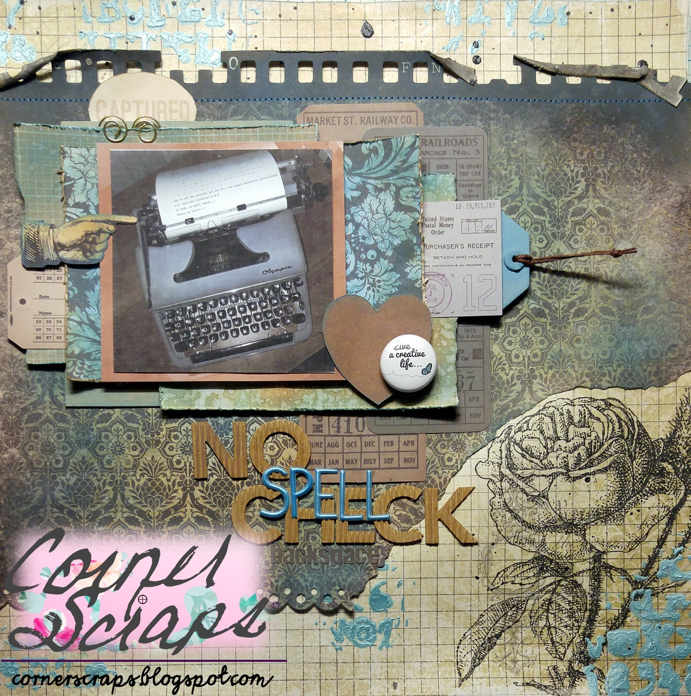
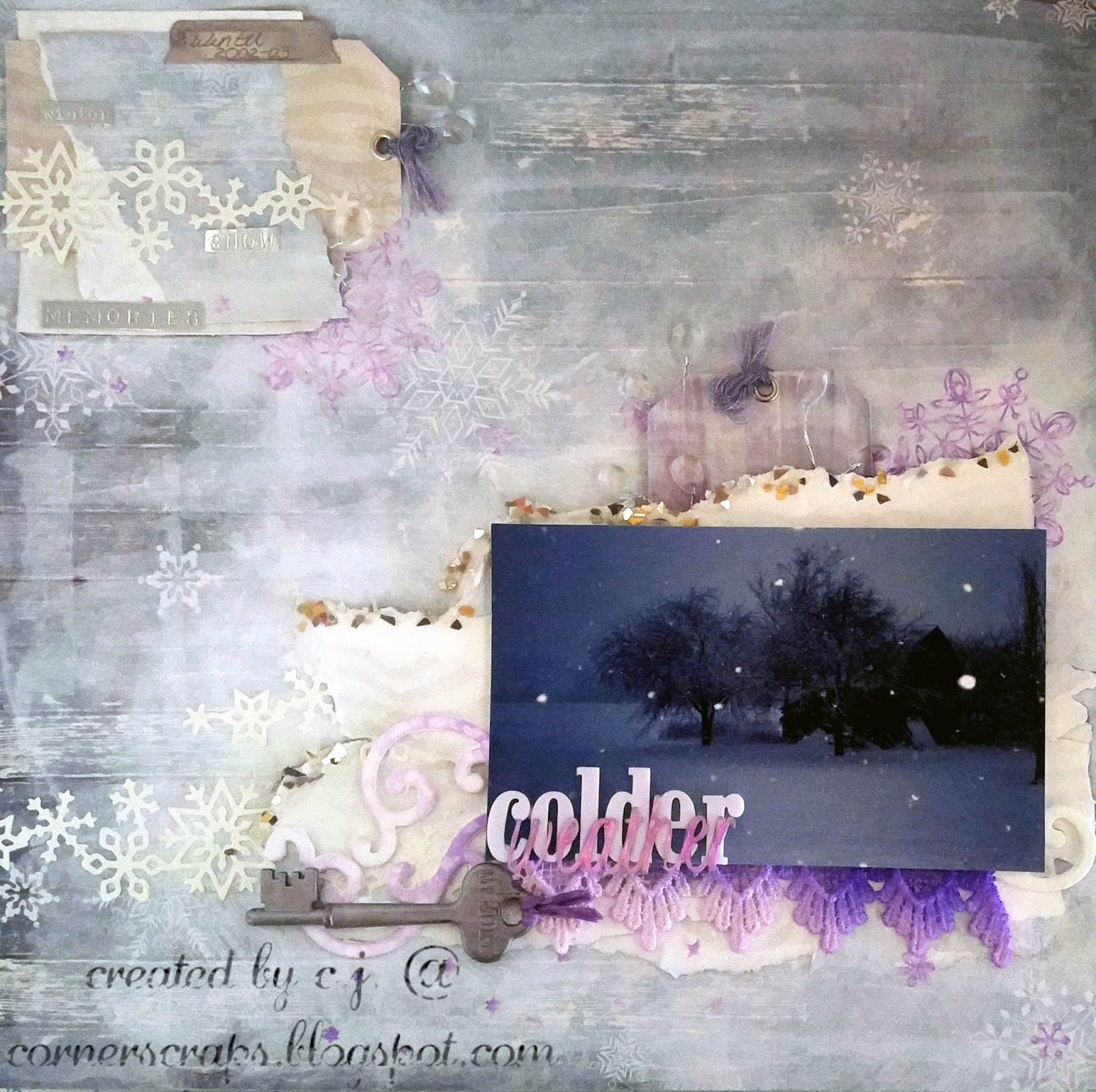
colder weather layout! (the shards along the edges of the torn paper behind the photo are Silver Glitter Shard Glass by ReneaBouquets, but I took the photo with no flash so there wouldn’t be glare off the shards or the metallic words at the top!)

Over at scrapbook.com, Amanda (scrapanda) hosts the Music Inspiration Challenge! For September I was given the song “Colder Weather” by the Zac Brown Band (lyrics link; video link), and this is what I came up with!

Way back when… (bet. 2002-2007) I lived in Michigan. This is a photo looking out our back door towards the dilapidated old barn that was on the property. I love the snow. I miss the snow. I don’t necessarily miss being cold 😄, but I have always found snow to be beautiful.

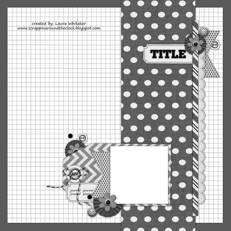
In addition to the Music Inspiration Challenge, I am also entering this in the October 1st, Stuck?! Sketches Challenge, using the following sketch as inspiration!

As you can see, I rotated the sketch 90°, and instead of rings and splatters, I used snowflakes from two Simon Says Stamps sets, “Frozen Fractals” and “Swell Christmas.”

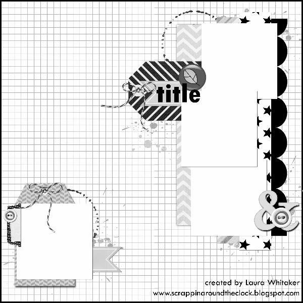
October 1st Stuck?! Sketches Challenge.

Product List:

  • ReneaBouquets Silver (Shard) Glitter Glass – (this is the 1st time I’ve ever used it … had to see how it worked and all! I already have other projects lined up now [in my head] and I know I have found a new product to LOVE!)
  • Simon Says Stamp – “Frozen Fractals” and “Swell Christmas” stamp sets
  • Shimmerz AcriTonez: “3 Sheets to the Wind”
  • Tim Holtz Distress Oxide, Stain, & Spray Stain – Wilted Violet; Nib Water Brush; Distress Collage Brush; Advantus Word Keys; Mini Snips.
  • Bo Bunny – Altitude Collection – Christmas – 12 x 12 Double Sided Paper – Blizzard & Noteworthy Journaling Cards; Sweet Life Collection – Chipboard Stickers
  • Ranger Glossy Accents
  • Prima – Finnabair: Snowflake Paste; 3D Gloss Gel; Metallique Wax – Old Silver & Brushed Iron, Opal Magic Wax – Royal Robes
  • Silhouette Cameo: The font for “weather” is “Cotton Candy” from the Silhouette Store 
  • Pink Paislee – Merry and Bright Collection – Christmas – Foil Stickers – Word Strips
  • We R Memory Keepers – Crop-A-Dile and Case – Pink – Includes Crop-A-Dile, Case and 100 Eyelets
  • EK Success – Sticko Alphas Stickers – Foam – Large – White
  • The lace under the photo and the ribbon on the key were both part of the “goodies” I received from Donna (bonprof) with my September PocketLetter from her! (Neither of them was originally purple, but with a little help from some Distress Stains, all of us got to turn purple! LOL)
  • The snowflake cuts I’ve had for quite a while. They came as a “subscriber bonus” with a Birds of a Feather Kit…and those kits haven’t been released since Feb. 2016!
  • The clear gem…teardrop…bling also came from a Birds of a Feather Kit, I think circa Aug. 2014.
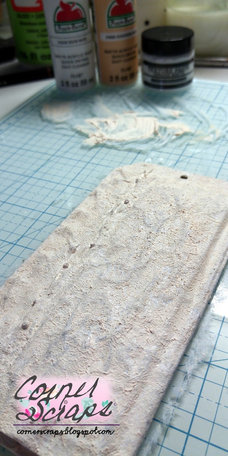
  • ‘generic’ white acrylic paint
  • white gesso

Hair Up Here

Hair Up Here

A layout featuring photos of yours truly at (almost) 11 years old! The journaling explains it all!

Me, in April 1990, attempting to get the high bangs that were in style at the time. Unfortunately (Fortunately?) I was given a head full of fine hair that has never cooperated!

This layout is for two challenges, the first being the August 1, 2017 Stuck?! Sketches challenge, using the following sketch:

The second challenge is the “Ugly Paper Challenge” over at scrapbook.com where I am the hostess. I first did the challenge back in August 2011 with the, I believe, original hostess. Then in 2012 (I think) the second hostess took over, and in March 2015 I took it over! So, as far as I know, I am the third hostess of the challenge. I haven’t done the challenge every month since I first found it (with the previous hostesses), but I have always loved the challenge! In short, two “ugly” papers and one (or more!) “ugly” embellishment(s) are mailed to another player (I give out addresses!) at the beginning of the month, and players have until the end of the month to create their layouts! The papers have to still be recognizable, and the embellishment is optional (it counts as two extra votes at the end of the month!). Now, this isn’t to say any particular papers or embellishments are “ugly,” but the combination given is! Most of the time anyhow! The challenge is receiving a combination that you may have never even considered putting together on your own, plus you are receiving papers that may not be your “style.” Anyhow, I just wanted to make it be known that “ugly” is a subjective term, and I have received (on more than one occasion) papers that were wonderful, even though the sender didn’t think so!

When I received my papers this month I immediately thought of my being a “tom-boy” growing up, but I just didn’t know what photos I had to use with them. It turns out I didn’t have the photos needed, my grandmother did, but I didn’t know that until our family has had to start sorting through her 88 years worth of possessions after she passed on August 3, 2017. And while it has been a sad time for the family, we have also discovered many items, mementos, and photos we didn’t know existed.

The papers, and embellies, I received for the August 2017 Ugly Paper Challenge

Product List:

  • Crate Paper – Chasing Dreams Collection – 12 x 12 Double Sided Paper – Royale
  • Ranger Glossy Accents
  • Sharpie Fine Point Writing Pens
  • Shimmerz Paints: Paste-eez “Raspberry Sherbet,” and Coloringz “Well Blue Me Down.”
  • Carta Bella Paper – 6 x 6 Stencil – Lattice
  • Pink Paislee – Paige Evans – Oh My Heart Collection – Ephemera with Foil Accents
  • American Crafts – Starshine Collection – Thickers – Glitter – Fitzgerald – Teal
  • Tim Holtz – Idea-ology Collection – Industrious Stickers – Deco Type
  • The black/grey glittery paper is DCWV, but it was in my scraps, and I couldn’t even being to guess what the stack was it came from!
  • Hip Kit Club Exclusive Enamel Dots (March 2017)
  • Unknown pink & white twine

explore

explore layout

Whew! After fighting bronchitis for over two weeks I finally finished the last layout I (mentally) started!

It did work out though that this weeks Wednesday Challenge over at Simon Says Stamp was to “Splatter It”! It worked out because I was working on layout this morning and I was thinking of what else to add, and when I saw the challege I thought, “That’s a good idea”!!

I used some Peeled Paint Distress Oxide on the title and to highlight the cardboard a little!
I used the “packaging technique” to add Peeled Paint and Iced Spruce Distress Oxides to my background!

Product List:

  • Tim Holtz – Distress Oxide: “Peeled Paint” & “Iced Spruce”; Alcohol Ink: “Lettuce” & “Gold”; Sanding Block; “Tracks” Stencil; and “Expedition” Ephemera
  • Pink Paislee: Cedar Lane: Greenspace
  • A bit of scrap Core’dinations green cardstock
  • A piece of corrugated cardboard
  • Ranger Texture Paste
  • Bo Bunny Chunky Charms: Clear Arrows & Circles
  • American Crafts: Shimelle: Stickers
  • Bella Blvd – Ciao Chip – Self Adhesive Chipboard – Words – Adventure
  • Hip Kit Club Exclusive Puffy Stickers
  • Shimmerz Paint: Celery 
  • Flair from {A Flair For Buttons}

Brain Freeze!

Oh what fun you do, Brain Freeze
This layout encompasses multiple challenges! First, it will be entered into the Stuck?! Sketches July 15, 2017 Challenge! The challenge for the second half of July was to use the following sketch designed by Laura Whitaker. For my layout, I decided to rotate the design counter-clockwise, which I thought worked better for me, especially since I have a longer title. This layout is also going to be entered in the July Sewing Challenge, July 5 Ingredients + Challenge, July Music Inspiration Challenge, July Hoarders Challenge, and the July Foodies Challenge over at scrapbook.com. Whew! That’s a lot of Challenges for one little ol’ layout!
July 15, 2017, Stuck?! Sketches Challenge Sketch designed by Laura Whitaker.
Now, to try and explain the challenges over at scrapbook.com! For the Music Inspiration Challenge, I was tasked with finding inspiration for my layout using a song chosen for me. My song was “You Make Me Wanna” by Usher. I’ll tell the truth, I never listened to the song, I read the lyrics over on A to Z Lyrics and I knew I’d never be able to handle actually hearing it! It’s just nowhere near the type of music I listen to! When I first thought up what photo I wanted to use, I was originally going to have my title based off the title of the song, and was going to have it be “You Make Me Wanna Scream,” but there is an Ozzy song (“Let Me Hear You Scream”) that has a very similar line. I just couldn’t connect Ozzy & Usher in my mind!! So then I decided to incorporate “This is what you do,” which is a line found over and over in the song! And I actually had “This is what you do, Brain Freeze” on the layout…but it just didn’t look right! I came across the “Oh What Fun” banner, laid it on the layout, and decided the title was going to be “Oh What Fun You Do, Brain Freeze,” because now it was a sarcastic title, and I speak fluent sarcasm! Whew, all that to use two words from the song!
For the 5 Ingredients+ Challenge, I had to incorporate yellow, button(s), smile, circle(s), and border, which I did. The Sewing Challenge had a twist of using red, white, and/or blue thread, I used blue and white (had to use at least two for the twist). The Foodie Challenge is to do a layout involving food, and the Hoarders Challenge is to use hoarded items on your layout (I believe everything I used is at least a year old)!
The journaling reads:
“We were having root beer floats one evening & I looked over & saw this face! I said it was too bad I didn’t have my camera ready and decided to get prepared in case it happened again! …It did, on the next bite! I asked if you were doing it on purpose so I could get a photo, and you said ‘NO!!'”
I love layering! The cut file is a free file from Paper Issues called Peek-A-Boo Circles.
Yes, adding the “#smile” was more sarcasm (as well as a requirement for the 5 Ingredients+ Challenge)!
Like I said, I love layering! And I love layering titles and mixing fonts!
Product List:
  • The tag under the photo is from Studio Calico
  • The papers “filling in” the circle cuts come from:
  • Pink Fresh: Felicity line, or
  • Pink Paislee : Paige Evans: Paper 06 from the Fancy Free Collection or,
  • Elle’s Studio: Little Moments: Details or,
  • Hip Kit Club Exclusive: Medowbrook: Notes From Home
  • Hip Kit Club Exclusive: Medowbrook: Diamond Shine
  • Webster’s Pages: Allison Kreft: Recorded: This & That
  • Teresa Collins – Summer Stories Collection – Border Strips with Glitter Accents
  • Thickers: Junebug: Charcoal
  • Tim Holtz: Big Chat
  • Thickers: Junebug: Charcoal
  • October Afternoon: Daily Flash: Story Book
  • Hip Kit Club Exclusive Alphas
  • Hip Kit Club Exclusive Washi Tape
  • Hip Kit Club Exclusive Puffy Stickers
  • Dear Lizzy Date Stamp
  • Ranger Jet Black Archival Ink
  • Sharpie Fine Point
  • Simple Stories – Sunshine and Happiness Collection – Decorative Brads
  • Crate Paper – Gather Collection – Thickers – Chipboard Accents – Blessed
  • Silhouette Cameo
  • All other products no longer have their packaging.

Let’s Go On An Adventure

Let’s Go On An Adventure Layout!

My oldest son in 2006, when he was 7 1/2, going exploring in my mom & dad’s backyard with his brother, using the “Explorer Kit” that my youngest had received for his birthday in 2005!

This week’s Monday Challenge over at Simon Says Stamp is “Distress It.” While I may not have a traditional “distressed” look, I did use some wonderful Distress Oxides on here!

Over at scrapbook.com I am hostess to the “Ugly Paper Challenge.” I first did the challenge back in August 2011 with the, I believe, original hostess. Then in 2012 (I think) the second hostess took over, and in March 2015 I took it over! So, as far as I know, I am the third hostess of the challenge. I haven’t done the challenge every month since I first found it (with the previous hostesses), but I have always loved the challenge! In short, two “ugly” papers and one (or more!) “ugly” embellishment(s) are mailed to another player (I give out addresses!) at the beginning of the month, and players have until the end of the month to create their layouts! The papers have to still be recognizable, and the embellishment is optional (it counts as two extra votes at the end of the month!). Now, this isn’t to say any particular papers or embellishments are “ugly,” but the combination given is! Most of the time anyhow! The challenge is receiveing a combination that you may have never even considered putting together on your own, plus you are receiving papers that may not be your “style.” Anyhow, I just wanted to make it be known that “ugly” is a subjective term, and I have received (on more than one occassion) papers that were wonderful, even though the sender didn’t think so!

Now that that’s out of the way, on to the details about the layout!

This is a picture of the papers & embellishments I received for the month of July:

The papers I received in the “Ugly Paper Challenge” over at scrapbook.com

Instantly I knew what was going to happen to that green paper! I already had a set of photos in mind I wanted to scrap when these arrived, and it was lucky for me that green paper just screamed “turn me into tropical leaves!”. The floral paper, well that was going to have to be shaped to my will!

A cut file and some Shimmerz turned my flowers into clouds!

As you can see, that floral paper became the outlines for the clouds! I used some Shimmerz: AcriTonez: 3 Sheets To The Wind and some Shimmerz: Anchor’s Away! It did a good job of hiding the flowers, which would have just look weird on this layout!

Some Peeled Paint Distress Oxide helped my green grass paper become tropical leaves!

With the green grass paper I cut out my leaves and put on a light coat of Peeled Paint Distress Oxide, and spritzed with water to “activate”!

Close-up of the embellishment cluster at the bottom.
Another shot showing more of the top of the photo embellishments!
Close-up of the title area! I love how the Distress Oxides came out on “Adventure!”

Cut Files List:

Product List:

  • Shimmerz: AcriTonez: 3 Sheets To The Wind
  • Shimmerz: Anchor’s Away
  • Silhouette Cameo
  • Distress Oxides: Peeled Paint & Faded Jeans
  • American Crafts – Starshine Collection- Cardstock Stickers – Accent and Phrase
  • Becky Higgins – Project Life – High Five Edition Collection – Chipboard Stickers
  • Bella Blvd – Ciao Chip – Self Adhesive Chipboard – Words – Adventure
  • Pink Paislee – Fancy Free Collection – 12 x 12 Double Sided Paper – Paper 06
  • Hip Kit Club Exclusives:
  • Paper: Medowbrook “Touch The Sky” (inside clouds) and “Starlit Sprinkle” (blue/white dot under photo), and The Happy Life “Ombre Sky” (background). All designed by Kim Watson.
  • All the puffy stickers
  • The teal Alphas
  • In addition to the Hip Kit products already mentioned, everything else came from Hip Kit Club Kits. I don’t know which ones, but I know they are from between March 2016 and July 2016. Not all products may be Hip Kit Club Exclusives, but I don’t have the packaging for them anymore so I can’t give specifics!
  • No Spell Check

    No Spellcheck {or backspace}

    This is the typewriter I learned to type on! The kind where you need reinforced fingers to “hammer” those keys down! I still own this typewriter, it was my dad’s, and I still use it when I want authentic typing.

    Kaisercraft “Art of Life” Collection

    I dug out some Kaisercraft papers I’ve had hoarded for I don’t know how long and decided they would work perfectly for my vintage style page about my vintage typewriter!

    Transparent gesso; nuvo “Aquamarine” mousse; Shimmerz “Coal” Paint; Tim Holtz “Typo” Stencil
    Distress Oxides “Vintage Photo” and “Broken China”
    Distress Crayons “Vintage Photo” and “Black Soot”

    I knew I was going to be folding down some of the top of this paper, I didn’t want it to be white, I didn’t want to add gesso, and I didn’t want any inks to possibly bleed through. My solution? Distress Crayons!

    Before adding “Broken China” Distress Oxide
    Inked up with Distress Oxides & sprayed with water to “activate”
    The button is from {A Flair For Buttons}
    Some Thickers Corrugated Letters, and some puffy alphas from Hip Kit Club!
     Product List: 
    • Shimmerz Paint: “Coal”
    • Hip Kit Club Exclusive Alphas for “Spell” 
    • The button/flair: {A Flair For Buttons} Etsy Shop  
    • Advantus – Tim Holtz – Idea-ology Collection – Ephemera Pack – Expedition
    • Thickers – Corrugated – Kraft Charm
    • Fancy Pants – Swagger Collection – 12 x 12 Cardstock Stickers
    • Kaisercraft – Art of Life Collection – “Film Strip” & ” Remember”
    • Martha Stewart Crafts – “Scallop Dot” Edge Punch
    • Maya Road Chipboard Shipping Tags
    • Tim Holtz Distress Crayons Set 3 (Vintage Photo & Black Soot)
    • Tim Holtz Distress Oxides – Broken China & Vintage Photo
    • Tim Holtz “Typo” Layering Stencil
    • Tim Holtz Journaling Tickets
    • Tonic Studios – Nuvo Embellishment Mousse – Aquamarine 
    • Tonic Studios – Tim Holtz – Paper Distresser 
    • The papers under the photo, the swirly gold paperclip, the heart, and “captured” all came in a RAK from Vivian Lake @ scrapbook.com (May 2017 Not To Be Squared Challenge) 
    • A bit of hemp twine  
    • Teal thread

    hello tag

    hello tag!

    I had an urge to use flowers and make a tag, it probably didn’t help that Pinterest had a few as “recommendations.” This is my first vintage/shabby chic tag, at least with this much to it! I learned something vital though, I kept seeing all those tags with layer upon layer, and I found out why…you need to add a new layer to cover up…unexpected results!


    The majority of the products used on this were either paper from my “scraps” drawer (yes, I really have one…or three!), or embellishments that no long have a package to identify them, or in the case of the flowers, never had a package!


    As you can see from the following photos, the original colors of most the materials didn’t make it to the end! I was experimenting with texture and technique and figured if all else failed I could always just paint it all! (Which is just about what ended up happening!)

    I used Mod Podge: Paper: Gloss as my adhesive (mostly because it was the fullest bottle within reach!) and scrunched up some tissue paper and stuck it down.
    Added a piece of corrugated cardboard and more tissue paper.

    I’ve had this scrap of paper for many years, and wanted to see if I could get the design/texture without the color. It didn’t quite work!

    Lots of Mod Podge and a sprinkling of seed beads, just to see if they’d stick!

    By now I was just going layering crazy and added some Tim Holtz tissue paper scraps I had to hold the beads in place and to test how hard or easy the pattern was to cover…but mostly to hold the beads.
    This was straight acrylic paint that went on thick so I used a baby wipe to try and smear it thinner, but eventually gave up because the red beads still showed too much!
    The final way I was able to cover all the colors, a mix Ranger Texture Paste with white and peach acrylic paint!
    Layers, to cover up those unexpected results!

    I used Tim Holtz’s Distress Oxide “Worn Lipstick” to at least have some of the colors come together! The only product I know (for sure) is the banner pieces, which is from the Teresa Collins “He said, She said” line.

    I used acrylic paint and some Ranger Texture paste on the gears, and that wonderfully textured coral colored paste is Shimmerz – Texturez – Crushed Coral.
    I added the Crushed Coral texture paste to the hearts, painted that “hello” white, and added my ribbon!